First of all, before I start anything I must say that these terms are used interchangeably but a mobile-friendly website is different from a responsive website.
A mobile-friendly website will look good on the mobile phone but it may not be a perfect solution because mobile phone’s screen sizes are rapidly changing with time. A mobile-friendly website may not have the same user experience on different screen sizes and resolutions.
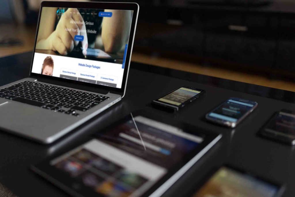
On the other hand, responsive website design allows a website to adapt to the size of the screen of any device whether it is a mobile phone, a tablet or even an XBOX.
There was a time when businesses were maintaining two versions of their websites one for desktop and one for mobiles. But now, things have changed, a responsive website has a better user experience on any device which eventually increases the chances of customer retention.
- There are many good reasons for having a responsive website.
- Better end user experience.
- Lower maintenance costs.
- Increased user engagement.
- Improves SEO effectiveness. Google is recommending the responsive design.
How do I know whether my website is responsive or not? Almost all modern browsers are providing this functionality but let’s talk about Google Chrome. Follow the steps:
1. Open the website in Google Chrome Browser
2. Press F12 and you should see the developer console on your right. Don’t worry, you don’t need to be a developer to do the test.
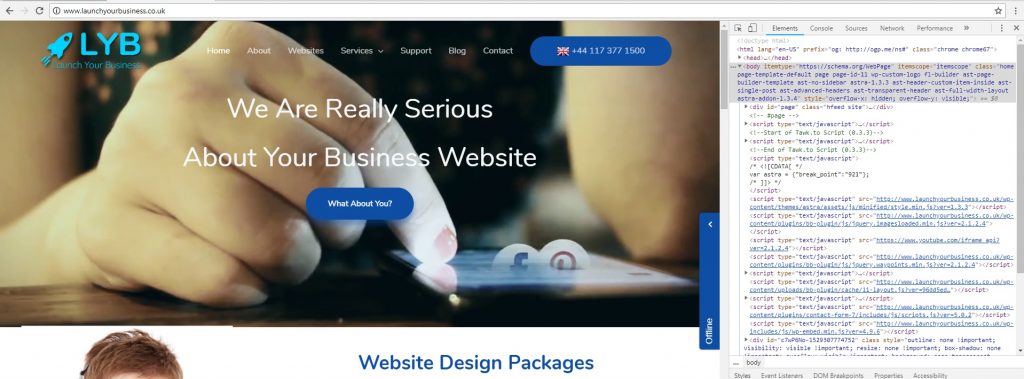
3. Notice the Toggle Device Button (or press Ctrl+Shift+M) on the top left corner of the Developer Console.
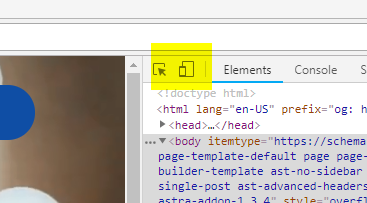
4. Press the button and that should invoke the toolbar at the top of the screen.
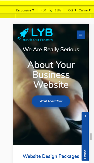
5. Now you can choose the different screen sizes, devices to see how is your website looking.
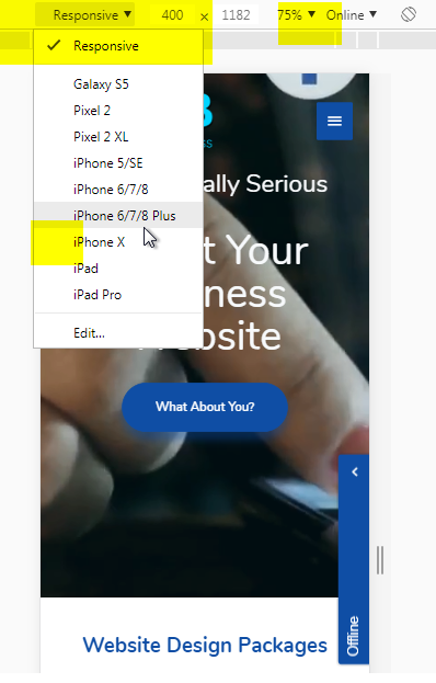
Bingo! Now, you know if your website is responsive or not, contact us if you need a responsive website design. At LYB, we are offering responsive website designs which are tested on multiple browsers to make sure that your customers get the best experience on any device or browser.
Pingback: Some WordPress Best Practices – Launch Your Business
If someone wishes to be updated with newest technologies, therefore, he must be visiting this web site and be up to date every day.
Hi! I’m at work surfing around your blog! Just wanted to say I love reading your blog and look forward to all your posts! Carry on the excellent work!
I would like to thank you for this information in your blog and happy to read this in future as well.
This is very interesting, You’re a very skilled
blogger. I have joined your rss feed and look forward to
seeking more of your great post. Also, I’ve shared your website in my social
networks!
Thank you so much, Cathern. We are always happy to hear from our customers. If you need SEO for your local business website please let us know. As you know, Launch Your Business is one of the best Website Designing & SEO Company in Bristol, Bath, Cardiff and surrounding areas.
Hi are using WordPress for your site platform?
I’m new to the blog world but I’m trying to get started and create my own. Do you require any html coding expertise to make your own blog?
Any help would be greatly appreciated!
No, you don’t need HTML but its something good to have.
Thank you so much, Milena. We are always happy to hear from our customers. If you need SEO for your local business website please let us know. As you know, Launch Your Business is one of the best Website Designing & SEO Company in Bristol, Bath, Cardiff and surrounding areas.
Pingback: Top SEO Benefits of Responsive Web Design – Launch Your Business
Pingback: Latest project: Crispy Dosa, London – Launch Your Business
Pingback: Latest project: Namak Indian Dining Bristol – Launch Your Business
Pingback: canada medication
Pingback: Latest project: Crispy Dosa, London – Launch Your Business
Pingback: Latest project: Namak Indian Dining Bristol – Launch Your Business
Pingback: Top SEO Benefits of Responsive Web Design – Launch Your Business