We received an assignment to create a great website for a client in the bakery business. We followed our standard procedure of first starting with a research project on the client’s business. The research data was then analyzed to come up with actionable information regarding the website. After this, we put together a team of food designers, photographers, UI/UX designers, and developers etc. to implement the findings and create a great website. The team was headed by a project manager with the most relevant experience.
We used the name, Hefe, as the starting point
Hefe is part of the German word for yeast. The word, Hefe-Weizen is shortened to Hefe and is used to refer to yeast in English-speaking countries. Baker’s Yeast is a very important part of the baking industry. It leavens the dough and also contributes to the bread’s flavour, texture and aroma. Baker’s Yeast was a breakthrough invention in the baking industry.
We converted the name, “Hefe”, to a research-backed triple-edged theme
The German-sounding name and the bakery business was our starting point for creating the website’s theme. We tried to keep the theme of the website as perfection in baking and baking perfection as an art form rather than just business/ service.
Our market researchers and analysts found that German bakeries are famous all over the world. There are over 3000 varieties of German bread and UNESCO has also officially recognized German bread as an intangible cultural heritage. The country holds the record for having the highest number of different varieties of bread on the globe.
Therefore, the triple-edged theme we arrived at were Variety, Perfection and bakery as an art form.
The Hefe logo in white with a red circle as the background
According to our research, the colour red and white is associated with foods like candy, toffee, etc. that are loved and are broadly classified as “Goodies”. The colour red and white is universally associated with celebrations (Santa Claus) and sweet candies. We did not want the appeal of the website to be just limited to one country. We enjoyed the website having a universal appeal. The red colour is associated with excitement and it grabs attention. The white colour stands for spaciousness and purity. The baker’s hat is created in white on a prominent red background. This gave the logo the universal appeal and the flavour of being a specialized bakery.
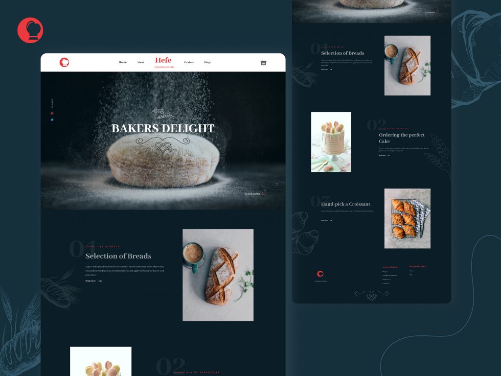
Logo at the top is followed by “Home”, “About”, “Hefe”, “Products”, and “Blog”
Foodies, Food connoisseurs etc. like to get information about their food. Therefore, we packed the website with plenty of links to great information on bakery products. Each of the information resources was also linked to a payment gateway through which the website visitor/ potential customer could make a purchase. This was done to create a more instructive and subtle call to action. This method also reduces the number of steps/navigations the potential customer/ website visitor needs to take to make a purchase.
Shopping cart icon at the top right-hand corner
The shopping cart was placed with links to the product catalogue, payment gateways etc. to communicate very clearly that the online customer could purchase from the website.
The Hero Image of freshly made bread under a spotlight.
The human eye and the brain are a visual processing team. The eyes send inverted images to the brain and the brain inverts it again to give the correct perception of the image. Another example is that the human eye of a person can see its nose. However, the brain ignores the view as it is not important. According to scientific research, the eyes are the first to see and form a perception of the taste of food. Make sure that we get the best Web Design Cumbria.
The research on this subject of human beings forming perceptions of food seems rather strange. Human beings first see the food and form a perception of its taste. Then they smell the food and further understand whether the food appeals to them or not. It is only after food appeals to the sense of sight and smell that human beings intend to taste the food with their tongue.
The human eye and brain play a very important role in determining the allure of food. According to studies, humans can see the flavour, aroma etc. of food. We put the freshly baked bread as the hero image. We came up with a special, professionally created image for this shot. A good Web Design Plymouth will certainly benefit you.
We ensured that this should appeal to the eyes of the foodie. We ensured that through this high-quality image, the website visitor/ potential customer can taste the ingredients and the aromas originating from the yeast’s fermentation. The bread is so freshly made that the viewer can get a taste of the delicious metabolites that are a precursor to the flavour. We ensured that the Hero image is a delight to the taste buds. Through this image, the foodie viewer/potential customer can feel the mild browning reactions, formation of melanoidin, and caramels in the bread crust. The baker’s yeast used for the process was also of the highest quality. It is a well-known fact among bread connoisseurs that high-quality baker’s yeast makes a very important contribution to the bread’s nutritional value.
Flour/Icing sugar being showered on the bread and the tagline, “Baker’s delight”
To give the impression of a delicious bread patty just getting ready for the foodie website visitor/ potential customer, we also made the Hero image a shot of a product almost getting finished by the maker to perfection. The bread-based product is projected as a work of art rather than just another food product. The term baker’s delight is used to point to the fact that this product is a piece of art and the baker is the artist. The baker is delighted by the perfection of the finished product.
The tagline “Selection of bread” + Pic
This time we tried to make the visual imagery more intense and appealing. Apart from the freshly made, perfect piece of bread, we also added a cup of steaming, beautifully flavoured coffee. We tried to appeal to the website visitor/ potential customer’s sense of taste, smell and touch.
The visual stimulation of freshly baked bread and coffee is not where the stimulation ends. People who love coffee usually like it for its rich, coffee bean aroma. We tried to stimulate the memory of the foodie website visitor about his or her experience with great-tasting coffee and bread. Coffee connoisseurs always like the warm feeling of touching a high-quality coffee cup with great-tasting coffee in it. We made it point to stimulate that pleasant memory of touching the warm coffee cup. According to our research, the images of the food on a website should be aimed at stimulating a sense of need for the foods pictured to get a high conversion rate.
The human brain responds to things like food (to satisfaction of hunger), beauty (for high-quality life and potential mate) and danger (for self-preservation and propagation ) in an emergency mode. We also attempted to make the setting as romantic as it could get without putting human characters in the picture. According to our research, the human characters would compete with the food products depicted in the picture. We wanted to create a romantic setting with the food products, fine cutlery etc. as characters in the story. This would enable the food products to get the undivided attention of the website visitor.
We also used incomplete imagery where the website visitor/ potential customer would unconsciously put himself or herself in this setting. The tagline and selection of bread are made to synergize with the image. The image depicts high quality and the tagline makes it known to the visitor about the variety as well as the high quality of the products available.
The tagline “Ordering the perfect cake” + pic
Baking perfection as an art form is the central theme of this website. Therefore we put a perfectly baked cake on a pedestal. We also made sure that the perfectly baked cake was balanced on a relatively small/ narrow pedestal leg to demonstrate the delicate technique that the bakery is capable of.
The cake was made in a pink-and-white colour scheme. The colour pink is the colour of feminity and compassion. The colour white is a symbol of purity and perfection. The cake is also made in a way so that the website visitor/ potential customer can see the fine-tuned technique of the cake makers/ bakers of the bakery. Part of the white icing is made in a way so that it looks like the icing is dripping.
As aforesaid, people start their feast with their eyes. This “Drip” would remind them of their dripping saliva at the sight of great-tasting food. This is a very subtle but very powerful association.
The tagline “Handpick and croissant”+ image of two different types of Croissant
The tagline also shows the variety that the bakery is capable of. It is linked to pages that show the entire range of croissants available. Once again, selected photographs of the food items that would make the potential customer/ website visitor salivate. In other words, we selected professional photographs which would be a feast for the eyes of the user.
Blog” with subheads
A great food website requires great written as well as photographic content. Foodies take their delicacies seriously. According to our research, connoisseurs of food also purchase and consume food to the bragging rights about the quality of the food. The taste of the food is not their only concern.
Therefore, we put links for writers who could contribute with high-quality content. We also put in a recipe section to further engage the foodie website visitor.
“More about bakery” with subheads, “Orders”, “Jobs”
It is said that people are the key to a business. This kind of high-profile, specialized bakery needs to employ the best people in business. Therefore, we put a link to a job section. Our researcher and analyst team also found an amazing phenomenon about the Turnaround time (TAT) for orders.
According to a case study in the food business, a great pizza chain stood based on the finding that consumers wanted to have warm pizza within 30 minutes of their order. It is a very renowned global pizza chain. On further investigation, our researchers found that the turnaround time (TAT) for orders is a very critical component of the food business. Therefore, we also put a link through which the customer would be able to place as well as track their orders.
Darkish blue background with off-white pencil sketches of croissants, grains of wheat, millet etc.
The shade of blue that we used to create the background of the website has been used by royal tailors to create intricately designed royal outfits. We used off-white pencil sketches of the bakery products, grains of wheat etc. to resemble the intricate designs of royal outfits. We wanted our website visitor/potential customer to feel like an exclusive guest at a royal banquet. The colour has very positive and calming effects on the mind and the body.
The Payment gateway integration was made through multiple buttons at various places to enable an impulse purchase. The website also has links for sourcing quality employees and quality writing content contributors. The first impression is very important and we took care of that with a great Hero Image which would keep the website visitor engaged. The attention spans of website visitors are getting progressively shorter. However, with research-backed data, we created a website which would give the business a maximum number of conversions.
The website targets the chemosensory, somatosensory, and visual receptors of the website users through vivid images and descriptions. These sensations add up to perceive foods quality, pleasantness and liking. This enables the conversion of the website user/ potential customer to a loyal customer. We created a research-backed website which would appeal to the inner chemistry of the visitor.
Conclusion
According to our research, we needed to create a website which would be like an exclusive invitation to a royal feast. The website needed to tap into the powerful role played by the eyes and the brain of human beings in making food choices. We created a UIUX design which would appeal to the sight and then to the nose and tongue of the website visitor/ potential customer. Apart from the artistic allure, we targeted high conversion rates as the Hefe website sells its products and services to customers or end-users online. The website was also with many instances of instructive CTA or Call To Action enabling foodie consumers to buy products online with minimum hassle.