We love to work on projects that give meaning to our profession. We were thrilled when we were approached by a client to create a lovely camping website. We followed our usual procedure of conducting very thorough market research to understand the client’s business at a grass root level. Our team of analysts then proceeded to analyze the researched data. We found that camping is one of the few activities which almost 90 per cent of the participants say that they were glad that they tried it.
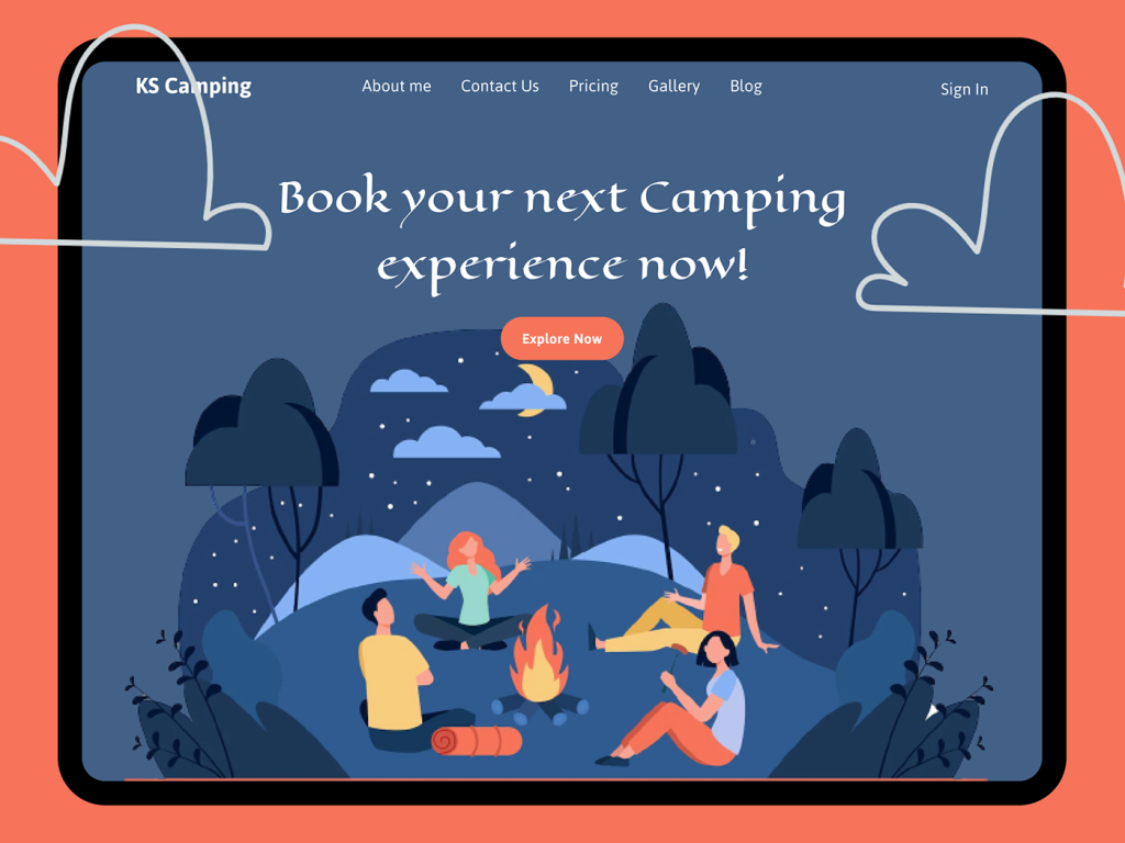
A red pinkish broad border was used as a frame
According to our research, It is a very normal human tendency to frame the pictures that they cherish. This is the reason we used a frame-like design for the picture of the camping. The colour scheme used is reddish pink. This pink colour is a combination of the colours red, white, and blue. Red is the colour of the pure passionate energy of life. White is the colour that gives an impression of space and innocence. Blue is the colour associated with mental calmness and open skies.
This shade of reddish, bluish-pink colour invokes an emotion of warm motherly nature. According to our research on colour psychology, this is the colour that invokes an emotion of motherly love and compassion. We used this shade as humans want to be cared for. The liking for motherly love and compassion is ingrained into the human DNA. It is something humans are programmed to like regardless of their age, creed, colour, and sex. In adults, this shade of pink is also very closely associated with the energy of romance. Exposure to this exact shade of pink reduces aggression in human beings and brings out their sensitive side. This colour is also known to appeal to women.
The first line “KS Camping”, is “About me” instead of the usual “About us”
We used the word. “About me” as camping has been described by our respondents as a very intimate experience with nature. It is usually enjoyed as a group activity but the significant part of a camping experience is the unbridled togetherness of the experience with nature at its best. After a camping experience, people realize how much they were missing out by being away from nature. Camping is a very personalized experience despite usually being a group activity. A camping trip enables people to break away from their mundane, scheduled life and find themselves by being one with nature.
The outcome of a camping trip is unity with nature, stress reduction, and rejuvenation. Therefore, we wanted to also personify the camping website as if it was an entity to who people could turn to find peace and tranquillity.
We created synergy in the KS camping website design primarily with reddish pink and shades of blue
The entire camping activity is a great symbol of a human being’s unity with mother nature. The concept of synergy is communicated through colours. According to our research, over 50 per cent of decisions taken by human beings related to the product are done through their first impression. Colour is an essential part of that first impression. It is said that colours influence thoughts and thoughts get converted into actions.
The Hero image of a camping trip
In this internet age, a website has a fraction of a second to create an engaging impression on the visitor. An engaging Hero image is a proven method of explaining the core business or service of the website with a single, large image.
The Hero image features the moon, tents, open skies, etc. as characters
We used a hero image with a bunch of happy campers under the open skies with their camps in the background.
The website is built with the word “Happy camper” in mind
The word “Happy camper” is an accepted figure of speech. The term happy camper refers to an individual who is contented and happy with his or her current situation, activity, etc. We made the image in parity to the term, “Happy camper”.
The synergy between the animated characters in the hero image expressed through colours
The use of animated characters is becoming increasingly popular. The appeal of animation is timeless, ageless, and beyond all boundaries. The best part about animation is that more than 90 per cent of adults in the civilized world associate it with happy, childhood memories. According to our research, happiness is one of the most important emotions experienced by a consumer who is about to make a purchase.
The animated world has no limits. The reason we used animation.
Since the 1930’s animation started gaining popularity as a medium. Animation is different from cartoons. Animation is created by animators who are different from cartoonists. The subject matter of animation can range from humour to serious topics. It is also considered a branch of art where a great deal of attention is paid to the intricate details of the characters, and the setting that they are in.
The static, animated image of the group of “Happy campers” was created by expert animators. 4 animated characters were created to deliver the imagery of happiness, unity with nature, synergy, etc.
The pinkish-red colour in the 4 human characters
One of the two women has pinkish-red hair. The other woman is wearing pinkish-red trousers. Among the two men, one is wearing a pinkish-red t-shirt and the other man is having a pinkish-red object. The object was made to resemble a camper’s blanket/ sleeping bag. All the characters have elements of the same colour, pinkish-red. The flame of the bonfire in the middle of the human characters is also partly made of a pinkish-red colour.
The darkish shade of yellow in the Hero image
The particular shade of yellow was used for 4 characters on the campsite. The moon, one of the male character’s t-shirts, part of the bonfire flame, and one of the male character’s trousers, and his hair is made of this particular shade of yellow. The yellow colour is often associated with the emotion of happiness. We wanted our communication to be very subtle. So, we chose a slightly darker shade of yellow.
We made it a point to include the elements of nature as characters in the hero image. Therefore, the moon, part of the bonfire flame, part of the clothing of two of the four characters, and the hair of one of the characters were made from this particular shade of yellow. This was also to drive home the communication about the synergy between the human characters and the elements of nature.
The different shades of blue colour in the Hero image
The clouds, two of the 3 camps on the horizon, and the t-shirts of the female characters are all made from different shades of blue. Once again, this colour scheme is used to indicate synergy between the characters in the Hero image. The subtle yet extreme level of synergy is indicated by the use of the same colour in elements of nature (clouds), standalone inanimate objects (tents), and the apparel of human characters (t-shirts). The t-shirts are used more as the self-expression of the human characters through colours rather than as inanimate objects. This is not unrealistic in the real world but the world of animation gives us the freedom to make or point in a very subtle way. If you get the best Web Design Essex, it will benefit you.
The characters are all looking at the same spot/ thing in the sky
We used very subtle but powerful imagery to communicate the unity of thought between the human characters and their focus on nature. One of the human characters (female) is looking at something in the sky and saying something in a very expressive way. Her very expressive speech is indicated by the way she has used her open arms to express herself. The other characters have also twisted/ turned their heads to varying degrees to look at the point in the sky to which she is pointing. This shows that their unified attention is on the spot in the sky. One of the 4 human characters is speaking and her subject matter (the spot in the sky) has the undivided attention of the other 3 members of the group.
The use of the grey colour
The colour grey has also been used in several places in the Hero image. The trousers of two (one male and one female) of the 4 human characters, part of trees, the shoes worn by two of the human characters, and the rock-like structures at the bottom of the image are all in grey. The grey colour’s positive psychological response is that it is the colour of maturity, reliability, and tradition.
A camping trip is usually in the wilderness. First-timers are usually very apprehensive about camping due to the element of danger associated with the wilderness. Therefore, we incorporated a shade of grey to communicate the safety and reliability of the service. Once again, the grey colour was made part of the human, nature, and inanimate objects of the Her image to communicate the synergy between the humans, inanimate objects (rocks), trees, etc.
A blackish shade of grey was also used in the small plants growing out of the rock-like structures, part of the tress, and shoes, in small amounts on the trousers of one of the characters. We used this tone to create a contrast but limited the use as darker tones of grey have a very solemn psychological effect. We just used it to create relief and contrast. As aforesaid, we put them at separate spots to create the desired synergy effect between the characters.
“Contact us”, “Pricing”, “Gallery”, “Blog”, “Sign in”
The standard query of the website user was put in the first line of the website. Apart from the informative blog, gallery, etc., we made it a point to include the pricing structure in the opening screen in the first line.
Aminated clouds act as hyphens to the line, “Book your next camping experience now!”
This line is instructive. It has a CTA button below which is also linked to a payment gateway. We used the animated cloud to subtly communicate that a KS Camping experience is a dream experience.
The “Explore Now” button in pinkish-red colour in contrast to the blue skies
The website leads to this CTA or calls to action button which is aimed at reducing the number of decisions that a potential customer has to make to make a purchase decision. This CTA button stands out in bold relief on the blue background and is linked to payment gateways. Make sure that you get the best Web Design Lincolnshire.
Romantic imagery was prioritized
The overall website communicates a romantic experience by two couples under the open skies with their camps in the background. The bonus features of camping like open skies, fresh air, friendship, conversations, etc. were communicated in a very planned manner. The relationship-building aspect of camping with friends or family is also communicated through the Hero image. The opportunity to have meaningful conversations while staying unplugged from screens, work, and chores was also demonstrated.
Conclusion
Each client requires a unique set of solutions for their website. The attention span of humans in this internet age is getting progressively shorter. Popular social media sites are also coming up with one-minute short videos. Websites of businesses and services have a very small split-second window of opportunity to make an impression to keep the visitor engaged.
We created a research-based website with a hero image to keep the potential customer/ website visitor engaged. We used UI/UX design to keep the potential customer engaged. We used expert testers to ensure that the website loads in a minimal time. This ultimately results in customer engagement and loyalty toward the business. We also got expert animators, designers, testers, and analysts to create as well as test for faults as a continuous process. Creating a great website might have its initial investment in market research, implementation, testing, correcting broken links, etc. but it pays rich dividends in the long run. The final design and the user experience will result in satisfaction as well as higher returns for your time and money.