It is said that people are the key to a business or service. We were very pleased when we were approached by a client to develop a great website landing page for recruiting services. We followed our standard procedure which has served us well for years. We started with thorough research on the client’s business. Our data management team then analyzed the findings of the market research to convert them into implementable strategies for the website landing page design. After this, we put together a team of expert UIUX designers, testers, solution providers etc. The team was headed by an experienced project manager.
A website’s landing page’s key result area is conversion. It is designed to impact a potential customer in such a way that he or she becomes a customer. We created the page to have the most powerful impact on the potential customer in a very subtle way. Make sure that you get the best Web Design Kingston.
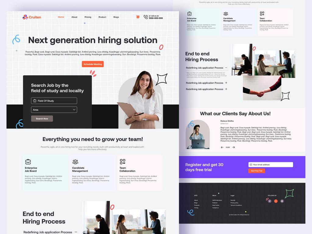
We named the website “Cruiten”
We wanted to choose a name for the business which would remind the website user/ potential customer of the generic word, recruitment. The industry for which the website/landing page caters is recruitment.
What is a generic word for an industry? A generic word for the industry is that word which is generally applicable to that industry. It refers to that particular industry, genus, group etc. It is not a very specific but a very generalized term.
We chose a specifically created word which sounds like the word, recruitment. Cruise and the latter of the pronunciation of recruitment sound similar. According to research, hearing/ reading a word similar to a generic word reminds the person of the original generic word. Additionally, rhyming words/ recalling similar sound words etc. is considered a fun activity. More importantly, emotions are a very important part of marketing. People often make a purchase decision if the purchased product makes them happy. There is every chance that a potential customer would unconsciously associate the word, Cruiten, with recruitment. This entire associative process that would run in the potential customer’s mind will be registered as a fun activity by his brain.
It is not a Rhyming word but partly similar sounding words. Rhyming words are defined as two or more words that have the same or similar type of end syllable or similar ending sound.
We had come up with the word recruitment and then removed a t
According to research, people pay more attention to work or words or sounds that are unfinished. It is true for all human beings. The thoughts of the unfinished word continue to occupy the mind of an individual even after he or she has moved on to do other tasks. These unfinished associations keep popping into the person’s mind and may even interrupt his or her other jobs. In the study of psychology, this phenomenon is known as the Zeigarnik effect. The unfinished project tends to continually occupy and influence the human mind. It is so powerful that it persists even if someone tries to block off the thought of the unfinished project to concentrate on other jobs/projects. It is a fantastic marketing tool for positioning a name in the mind of the potential customer.
This is the very effect that television serials have used to keep their target audience engaged for decades. The story/ drama does not end when a particular episode ends. They try to end a particular episode when the drama is at its height. The phenomenon was first discovered by Bluma Zeigarnik who noticed that waiters had fantastic memories of unpaid orders compared to orders by customers who had already paid. Later studies showed that a person’s internal motivation, value premise etc. plays a major role in the extent of memory he or she has for the unfinished project.
Human beings judge all stimuli from the environment based on their perception. Once a human being perceives a set of information, it gets stored in their sensory memory for a few moments. If the person pays attention to it and considers it important, it gets stored in short-term memory. If the human being/person does not pay attention to it or does not consider it important, the information gets deleted from the sensory memory itself.
This is where a phenomenon called perceptual predisposition becomes very important. The things that are important to a person are usually a part of his perceptual predisposition set. He or she will pay attention to things that are part of his or her perceptual predisposition set and will ignore things that are not. This word, Cruiten, was chosen due to a combination of the Zeigarnik effect and Perceptual predisposition set.
Human beings forgetting something is equivalent to the deletion of something from a computer’s hard disk. The information retrieval process is very complicated and requires expert help. According to the Zeigarnik effect, incomplete tasks lead to cognitive tension in human beings. If the task is part of his or her perceptual predisposition set, he or she has a high probability of remembering it.
Therefore, a person who has recruitment on his mind is very likely to remember similar-sounding words (recruitment) if he or she has a recruitment task. We removed a t from the word, Cruitant and came up with the word, Cruiten. This word is incomplete and according to the Zeigarnik effect, will register as an incomplete but relevant task in the person’s predisposition set who has recruitment on his mind. A good Web Design Cornwall will be beneficial.
The “Cruiten” logo is made primarily in the orange colour
Orange is a colour which is strongly associated with being energetic and vigorous. It also grabs attention. According to our research, people who were shown a splash of orange colour described their feeling as mentally uplifting, happy etc. It is also associated with beautiful pleasant autumn evenings, playfulness, the refreshing and tangy taste of orange, vibrancy etc. Shoppers associate orange with great value-for-money products/ services. We also used the colour blue which is associated with opportunities (open skies) and mental calmness.
A section of the page designed to look like a 3d page for extra attention
We divided the landing page into two sections or what appears like two pages. One section (part of the same landing page) is made to appear like it is being projected in 3D at the viewer. The other part of the same page appears like a large background page which occupies the full screen. The two pages are separated by the use of a “virtual shadow” cast by the 3D page on the larger background page. The 3D page is also made of a lighter and brighter shade.
As aforesaid, landing pages are very important in terms of conversion of the potential customer to an actual customer. The actions taken by a website/ web address visitor on the landing have a direct bearing on the revenue. This landing page is specifically designed to be the follow-up act to why the user/visitor landed on the page. We offered something unique with a projecting out at the user as a 3d page. The 3 d effect of the page was created by use of the shadow of the page that is cast in the background page.
The first line includes “Home”, “About”, “Pricing”, “Product”, “Blogs”, “shopping cart” and a Call us on “1….” Number
We designed the landing page to convert the visitor to a customer. The first line of the landing page has all the necessary information that the user needs to decide on his or her purchase. It also has a link to a helpline which encourages the interested, potential customer to make a call.
The pricing information, shopping cart etc. is also made available to the potential customer. He or she can also click on blogs to know more about the products/ services offered.
The Call-to-Action button which says, “Schedule Meeting”
Before making the purchase decision, the customer might need to schedule a meeting with company personnel. To take care of that particular need of the potential customer, we put a button with a link with which he or she can schedule a meeting with company personnel. The meeting has both on-site and online options.
“Next Generation Hiring solution” on the second line of the 3D page
Our client intended wanted a unique positioning for his services. In advertising parlance, the word, positioning, refers to how the product or service is positioned in the mind of the customer. To have a unique position in the customer’s mind, the product or service also needs to be distinguished from its competitors. “Recruiten’s” unique positioning is that it is a next-generation hiring solution.
In the current product/service parlance, a next-generation product/service is considered to be an improvement over the past generation. It is considered an acceptable fact that a few generations of improvement of the product or service make the older version of the product/service obsolete. This is the primary reason that we have focused on the words, “Next generation”. We have also put it in the second line of the 3D section of the landing page for it to get the attention of the website user/ potential customer.
A blue “Rope tangle” animation to the left of “Next Generation Hiring”
A “red imperfect circle” animation to the right of “Next Generation Hiring” which resembles a Halo
We used a very subtle animation from left to right to send a very strong message to the potential customer/website user. The “ rope tangle” animation represents the problems that the potential customer/website user might have in his or her life before experiencing the “Next generation hiring” services of “Recruiting”. We used the fact that the English language is read from left to right. The red imperfect circle, Halo-like animation represents the satisfaction that a customer of “Recruiten’s Next Generation Hiring” services would experience.
The use of animation for advertising is getting increased acceptance in web-based promotions. Animations can create a reality where anything is possible. More importantly, most grown-ups have a very happy childhood association with animation. According to research, a customer being in a happy state of mind is a significant factor in customer conversion.
“Search jobs by the field of study and locality” Dialog box
This is an indication of the specific services that are offered by Recruiting. A candidate can search for jobs based on his or her field of study, location etc.
“Enterprise Job Board”, “Candidate management”, “Team collaboration”
This is another part of the page that gets into the specifics of the services offered by “Recruiting”. Each of the descriptions is connected to more information which is connected to payment gateways. These buttons can also lead to a purchase. During this page design process, we have always kept in mind that this landing page’s KRA or key result area is conversion. Therefore, we have placed links to information buttons which may also lead to a purchase. This is more of an implicit CTA or call to action button rather than a very direct CTA or call to action button.
The bottom of the 3-D page has two images and a touch of animation. End-to-end Hiring process + Image of an anxious, stressed candidate + Image of two people sitting facing each other and exuding a sense of relaxed, calmness. The red, “Halo-like” imperfect circle
The bottom of the 3D projected page once again shows a series of photographs which once again communicates/ reinforces the positive change that the services of Recruiting can bring about in a person’s life. The entire series is designed to synergistically communicate positive change.
A person is shown alone in a slouched posture, working on making an application. The next picture shows two people with positive body language. The second picture is also punctuated with the “Halo-like” red circle to hint at the positive change brought about by Recuiten’s services.
The section of the landing page that looks like a larger background page
The 3 D page is designed to grab the attention of the website user. The section on the same page which looks like a background page is designed to reinforce the information and provide more details.
The background page starts with “Enterprise Job Board”, “Candidate management”, “Team collaboration”
This is a repetition of the same section on the 3D section of the landing page. This is also linked to more information, payment gateways etc. This reinforces the information in the 3D section of the landing page. The “Next Generation Hiring solution”, blue “Rope tangle” animation to the left of “Next Generation Hiring”, and the “Halo-like red imperfect circle” animation to the right of “Next Generation Hiring” are all repeated to reinforce the message about how its service positively impacts a person’s life.
“Redefining the job application process” along with a picture of a handshake
This is put on the section of the landing page which looks like a larger background page to send a positive image of successful recruitment. This was designed to appeal to the recruiting company as well as the job seeker.
What our clients say about us ?
According to our research, landing pages which have positive customer reviews have higher conversion rates than landing pages which do not feature customer reviews. In the pre-internet era, consumers would ask their friends, relatives, peer groups, etc. for opinions, and recommendations before making a purchase decision. In this internet age, customer reviews are considered to be the accepted social proof.
Register and get 30-day free trial
This was done to encourage the customers to register. The potential customer is enticed with a gift (free 30 days trial) as an incentive to register. We put this o the section of the page that was designed to look like a larger background page as this takes the engaged customer closer to conversion.
The site, More, Legal, Follow us in the last panel of the “Background page”
The additional information regarding the legal matters, social media presence etc. of Recruiting was put at the end for additional information to the already engaged customer/ potential customer.
We made it a point to test the loading time of the page
Better conversion rates lead to higher revenue generation. This landing page was designed with carefully planned, advanced UI/UX design. It is said that one does not get a second chance to make a first impression. A great landing page has to make an impact on the user within 50 milliseconds. We tested the loading time of Recruiten’s landing page to ensure that it loads quickly enough to make a great impression on the user within seconds. This is very important as it results in higher conversion rates.
Conclusion
The recruiter’s landing page was tested repeatedly to make it engaging and user-friendly. Apart from loading time, the media, keywords, links etc. were also tested repeatedly. All broken links were repaired. A personalization and positive vibe of the page were prioritized to enhance conversion rates. The call-to-action buttons were strategically placed by providing specific information. The message of the page was kept unified and simple to keep the website user/potential customer focused. Home pages usually have an overload of information but a landing page just focuses on the conversion of the potential customer to an actual customer. Creating a great UI/UX design entails detailed market research and meticulous implementation. This pays off in the long run with much higher conversion rates.
Pingback: URL