Each client has unique requirements. Each of these requirements calls for a thorough understanding of the problem which leads to a tailor-made solution. We were approached by a client with a bakery business to develop a website which offered everything but focused on premium quality brown bread. In certain cases, the solution can be derived from our past case studies but for this website, we had to develop an approach that we had not used for any client. We started our journey towards creating a unique website through market research on brown pieces of bread. We made brown loaves of bread the core of the website in a very subtle and simple way. We also had to inform the website visitor that this bakery also the other products that customers expect from a bakery.
The way we created the brown bread focus of the website
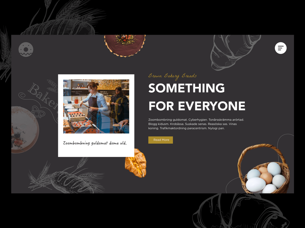
Freshly baked pure brown bread is considered to be a delight for foodies. On the nutritional front, brown loaves of bread are considered a very healthy option. Brown bread’s high fibre, vitamin and mineral content makes it a very appealing and healthy choice. According to medical research, brown bread keeps a check tab on a person’s blood sugar level, reduces bad cholesterol (LDL or Low-density lipoprotein), and also smoothens bowel movements. Since it is low in calories, sandwiches made of brown bread are considered a very healthy go-to snacking option. Therefore, we used a hero image of the baking process.
A hero image is used for websites to communicate the utility of the website to the visitor in a snapshot.
A hero image which looks like a Polaroid photo
The bakery is old-school and individualized. Therefore, we encased the hero image of the two women in the bakery as a Polaroid shot. A Polaroid photo was an instant photo before the digital age. The Polaroid photo gives a classic, old-school feel to the website. Various bakery products were put on display to ensure that visitors knew that the bakery offers a wide range of products. However, the focus is on brown pieces of bread.
An overall black background was used
Black is the colour of power. A black background communicates the power of the bakery in a very subtle way. The feel of the bakery is similar to a Mom’s kitchen. A person may eat at high-end places but people rarely forget their own mother’s kitchen and the food it served. You should opt for the best Web design Burnham.
The Hero image was placed on a smaller grey background over the black background
Grey is the colour which represents maturity and trust. We used a shade of grey that is very common and painted the shapes of croissants, pieces of bread, and grains on it to keep off the association of the colour with gloominess. We ensured that the slices of bread, grains, etc. on the grey background look like shapes that have been woven into a grey fabric. The overall feel that the visitor would get from the grey background with shapes is that this business oozes mature, efficient and homely handling of its business affairs.
Brown bakery slices of bread written in cursive style in golden brown colour
The cursive style of writing was considered a very upmarket and noble practice in the olden days. The renaissance started the printing press and made books and education available to the common man. However, in the pre-renaissance era, books were mostly handwritten and were available to the nobility and the wealthy. The renaissance and the invention of the printing press changed the scenario.
However, the cursive style of writing is still associated with human beings as something worthy of nobility and the blue-blooded. This is the reason why we used the cursive style of writing for the words, “Bakery brown slices of bread”. The letters are written in Golden colours which further enhances the classic, blue-blooded feel of the website as well as the business.
“SOMETHING FOR EVERYONE” written in bold in white colour
The colour white represents regal, authority and calmness. We put the words, “SOMETHING FOR EVERYONE” in bold and white to communicate that this exclusive bakery offers a wide range of products. It has a plethora of products which can satisfy the needs of all customers. This reinforces the basic combination that this bakery specializes in high-quality brown slices of bread but also offers a very wide range of products.
According to research, a very wide range often confuses the customer. Therefore, we are not advertising the entire range but making the customers aware that you do not need to look further than this bakery for your need for high-quality bakery products.
Photograph of a part of a cake at the top
To further communicate the range of the products that the bakery offers while focusing on brown slices of bread, we used this very subtle imagery. We put the photograph of a delicious cake at the top.
A CTA Button with the words, “Read More” beside the Hero Image
A CTA button which says, “Read More” was placed below the hero image. The CTA button is very subtle and powerful. It leads the user to the product menu, prices menu etc. of the website. It is also lined with relevant payment gateways to enable the user to make an immediate purchase. This CTA button is positioned to lead the user to purchase in a very instructive and subtle way. The CTA button links also contain links to descriptions of how quality products are made, the ingredients that go into making these exclusive products etc. According to research, foodies also like to read about the exclusiveness of their food.
Photograph of a basket of white and brown eggs at the bottom right of the page
We put a vivid picture of an assorted egg on the website to satisfy both brown as well as white egg lovers.
Conclusion
We researched, analyzed and then arrived at a design strategy for the website. We found the sweet spot by focusing on the habits and practices of the target audience of the website. The website focused on the needs of the target audience. The intricate details of the website were made as friendly as possible with the extensive UI/UX design. We also used testers to ensure that the website loads at optimal speed. The broken links were repaired. Our experience with this project is that the devil is in the detail. Our detailed research, creation and subsequent testing ensured that this website gives the maximum rate of return to the website owner.